


The interiors that European homeowners were buying in 2017 were almost the opposite of the interiors they would buy in 2022. Scandinavian functionalism had been the look of choice for a decade: pale woods, white walls, soft grey textiles, the Stockholm IKEA showroom as the global benchmark for what calm looked like. Then Japanese influence pushed back. Pinterest boards started showing rooms with lower furniture, darker accents, more imperfection, more shadow. Design publications gave the new look a name. By 2020, Japandi had become the most-saved interiors search term in the UK.
The hybrid is not a marketing invention. The two traditions it draws on, Japanese minimalism and Scandinavian functional design, were already in conversation in the 1860s and 1870s, when Japanese woodblock prints reached Paris and quietly rearranged how European artists composed pictures. What changed in the 2010s was domestic taste catching up with what art history had known for 150 years.

This is a practical guide to choosing wall art that fits the Japandi look. The principles below are drawn from Japanese design literature (Patricia Graham, Shozo Sato, Olga Mecking on the related Dutch concept of niksen) and from the canon of Japanese woodblock and ink painting. The rules are simple. The execution is harder than it looks.

What Japandi actually means
Japandi is a portmanteau of "Japanese" and "Scandi". The style emerged in Northern European design publications around 2016 to 2018 and crossed into UK and US interiors writing by 2020. It joins two design philosophies that already shared a quiet aesthetic vocabulary.
Japanese minimalism is rooted in Zen Buddhism and the principle of ma, the negative space that lets the eye and the mind rest. Furniture sits low. Materials are natural and visible: untreated cedar, washi paper, undyed linen. Ornament is sparse and deliberate. The household items count as art when their making was careful.
Scandinavian functionalism, as it developed from the 1930s onward, took a different route to a similar destination. Pale wood (oak, ash, birch), candlelight against long winters, textiles that invite touch. The Danish word hygge describes the resulting feeling: warmth that is unforced and unstaged. Furniture is built to last, simple in form, sometimes painted in muted earth tones.
Where the two styles overlap is the love of pale natural materials, the rejection of clutter, and the preference for handmade craft over factory polish. Where they differ is in colour temperature. Japanese palettes lean cooler (ink black, slate, indigo). Scandinavian palettes lean warmer (cream, oat, terracotta). Japandi sits in the middle.
The first rule: negative space
The single most important principle for Japandi wall art is the Japanese concept of ma. In sumi-e ink painting, the unpainted area of the silk or paper is not absence. It is part of the composition. The viewer's eye is meant to travel across the empty ground before it lands on the subject, and the silence around the subject is what gives it weight.
This translates to a simple wall-art principle. The empty wall on either side of a print is doing as much work as the print itself. A small print on a large bare wall reads as confident. A wall stuffed with framed images reads as anxious. A salon-style gallery wall is the opposite of Japandi.

The palette: ink, oak, cream, soft black
A working Japandi colour scheme begins with three base tones and one accent. The bases are cream or warm white on walls, pale oak or ash on floors and furniture, and an undyed linen or oat textile for soft furnishings. The accent is ink black or deep charcoal, used sparingly: a lamp base, a picture frame, the dominant ink in a single piece of wall art.
Secondary accent colours that work: indigo, soft terracotta, sage green, muted ochre. These should appear in small quantities, ideally drawn into the room through the art itself rather than through textiles. A single Hokusai print with a strong Prussian-blue passage will set a quiet tone that a hundred cushions cannot.
Colours to avoid: bright primary red, hot pink, lemon yellow, anything that reads as glossy or saturated. Pine and golden oak both push the room toward 1990s Scandinavian rather than the Japandi register, where wood tones are more grey-leaning.
Art subjects that suit the look
Some categories of print sit naturally in a Japandi room. The best place to start, and the easiest move for a buyer new to the style, is Japanese woodblock printing in its quieter modes.
Sumi-e and ink-wash landscapes. The fifteenth-century master Sesshu, the Zen monk Hakuin Ekaku, and the early-modern teacher Shozo Sato all worked in a single ink across a pale ground. Their compositions are typically one mountain, one branch, one boat. The blank silk does most of the work.
Kachō-e bird and flower prints. Ohara Koson (1877 to 1945) and his Meiji-era contemporaries produced thousands of single-subject prints in muted palettes. Crow on a Snowy Branch is the canonical example: black bird, white ground, no decoration around it. Most Koson prints fit a Japandi room without modification.
Restrained ukiyo-e. Hokusai and Hiroshige are usually associated with strong colour, but both made monochrome or near-monochrome editions. The Hiroshige snow scenes from One Hundred Famous Views of Edo, with their grey skies and bare-tree silhouettes, are quieter than the full series. Pick those rather than the bright Hokusai red-and-blue waves.

Calligraphy and abstract line drawings. Japanese shodō (calligraphy) and Western line drawings in the manner of Matisse or Egon Schiele's late ink portraits both translate well. The shared quality is restraint: a confident gesture, no rework, no decoration.

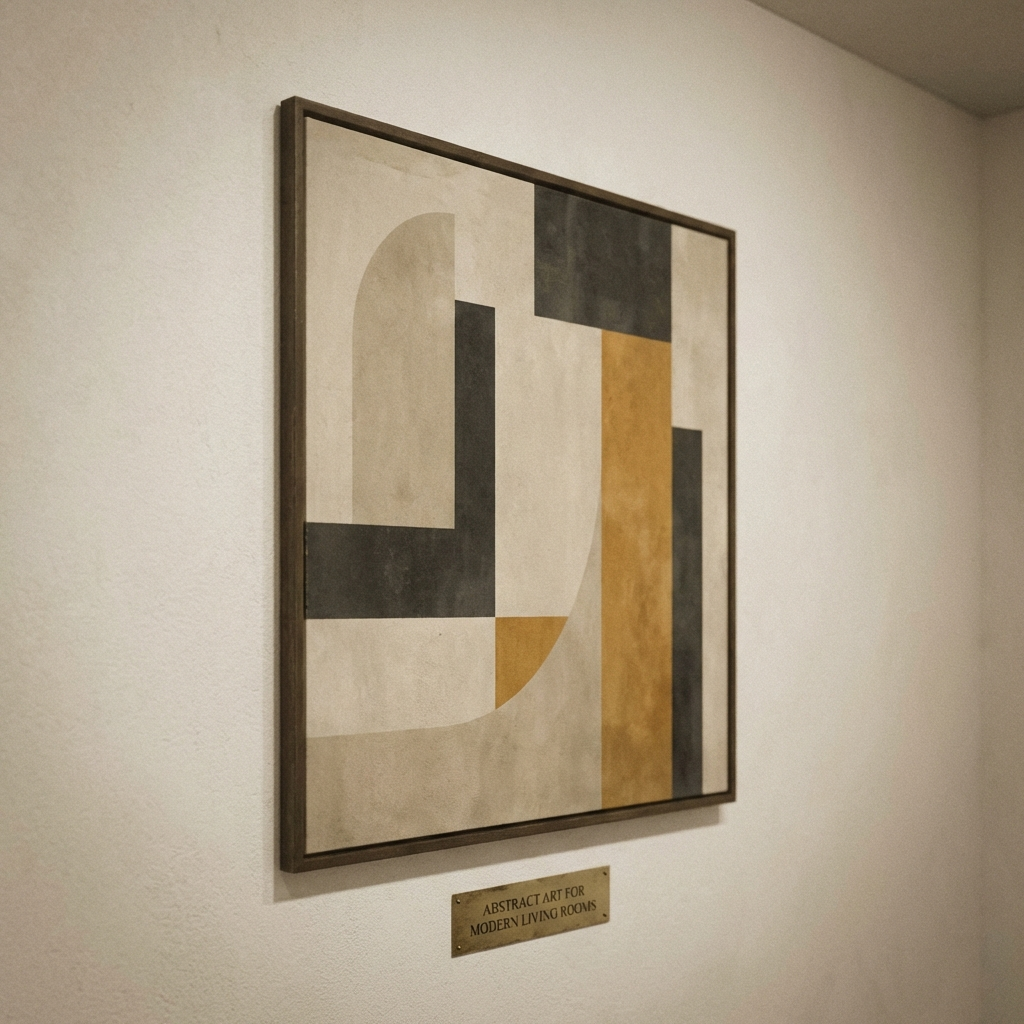
Pared-back Bauhaus and early modernist work. Joost Schmidt's typography, Paul Klee's pencil studies, Hilma af Klint's restrained-palette work all sit alongside Japanese pieces because they share the same minimalist logic. The trick is to choose Bauhaus prints in cream, ochre, and black rather than the primary-colour versions.

Framing and placement
Framing matters as much as the art. The Japandi register narrows the field considerably.
Light oak or ash. The default. Pulls the room toward the Scandinavian end of the spectrum. Best for pale-ground prints, kachō-e on cream, and any work with a strong ink presence that needs to be balanced.
Matte black. A sharp defining line. Echoes the ink in many Japanese works. Use with restraint: one or two black frames in a room, not five. Best on prints with strong negative space.
Natural-wood scroll mount. For a traditional Japanese touch, canvas or paper prints can be hung from a horizontal wooden batten with linen or cotton cord. Reads as quietly luxurious. Works particularly well for sumi-e landscapes and calligraphy.
No frame at all. For unmounted prints on heavy paper, a magnetic poster hanger in black-stained wood or oak gives the cleanest result. Strips of cord-suspended timber, often labelled kakejiku-style, are sold by most British framers.
Hanging height is lower than the Western default. Centre each piece at 145 cm to 150 cm above the floor, rather than the conventional 155 cm to 160 cm. This suits the lower furniture lines of a Japandi room and reads as more considered.
Japandi, Japanese, Scandinavian: how they differ
Three styles often blur together. Each can be identified by a single test.
Pure Japanese. Cooler. Inks and indigos. Cedar wood. Often near-monochrome on the wall. Mood is contemplative.
Pure Scandinavian. Warmer. Cream and oat. Birch and ash. Abstract shapes, mid-century posters, line art on white grounds. Mood is comfortable and functional.
Japandi. A middle palette: charcoal, oak, cream, soft black. Japanese subjects in Scandinavian frames, or Scandinavian abstracts on cream grounds anchored by a single ink-heavy piece. Mood is calm and grounded.
If your existing interior is already Scandi, the entry point to Japandi is to add a single piece with strong ink content (a sumi-e landscape or a Koson bird) and one piece of matte-black hardware to anchor it. If you collect Japanese woodblocks already, the step in the other direction is to introduce a piece of pale-oak furniture and a cream-ground textile that softens the ink-and-paper register.
Common mistakes
The fastest ways a Japandi wall goes wrong:
Too much beige. Without an ink-black or charcoal anchor, the room loses contrast and reads as bland rather than calm. The whole point of the Japandi palette is the tension between pale grounds and a single deep tone.
Wrong frames. Dark walnut, gilded gold, and high-gloss white all fight the look. Ash, oak, and matte black are the safe set. Brass and unlacquered metal can work occasionally, but they push the room toward mid-century Scandinavian rather than Japandi.
Salon-style gallery walls. A wall stuffed with frames is the opposite of ma. One piece with breathing room beats six pieces fighting for attention. If you must have multiples, hang them in twos, not threes, and asymmetrically.
Loud florals. William Morris is a wonderful designer, but he is not Japandi. The same goes for traditional botanical illustration, Persian-style florals, and any pattern that reads as heavily decorative. Save them for a different room.
Glossy frame finishes. Matte finishes only. Gloss reflects light and breaks the calm.
Where to start
If you are building a Japandi wall from scratch, the simplest route is to begin with a single piece of Japanese woodblock or sumi-e work and let it set the tone for everything else. Our Japanese Art collection covers ukiyo-e, sumi-e, and kachō-e prints in the registers above. Ohara Koson and Seiho Takeuchi are the easiest first purchases for a Japandi room.
For the Scandinavian-modernist counterweight, the Bauhaus collection offers restrained-palette work that pairs well with Japanese pieces. Select one item, not three, and frame it in ash or matte black.
Frequently asked questions
What is Japandi style in simple terms?
Japandi is a hybrid interior style that combines Japanese minimalism with Scandinavian warmth. It uses pale natural materials (oak, ash, linen), restrained palettes (cream, charcoal, soft black), and emphasises negative space over decoration. The result is calm and uncluttered without feeling cold.
What colours work in a Japandi room?
Start with a base of cream, oat, and warm white, anchored by ink black or deep charcoal. Soft terracotta, sage green, and indigo can be used as small accents. Avoid bright primaries, hot pinks, and yellow-toned woods such as pine.
How do you hang Japandi-style art prints?
Hang fewer prints, lower, with more space around them. Centre each print at roughly 145 cm to 150 cm above the floor, slightly below the standard Western eye level. Leave at least 30 cm of clear wall on either side. One statement print per wall is usually enough.
Is Japandi the same as wabi-sabi?
No. Wabi-sabi is the older Japanese philosophy of finding beauty in imperfection, asymmetry, and the patina of age. Japandi borrows that sensibility but adds Scandinavian warmth and functionality. A wabi-sabi interior can be austere; a Japandi interior is always softened by Scandinavian comfort.
Which art subjects suit Japandi interiors?
Ink wash landscapes (sumi-e), single-subject bird and flower prints (kachō-e), pared-back Bauhaus posters, abstract line drawings, calligraphy, and quiet seascapes. Look for one focal subject and plenty of empty background. Skip busy florals, photorealistic portraits, and high-saturation modern prints.
Does Japandi work in small UK rooms?
Yes, particularly well. Japandi grew partly out of Japanese apartment design, where space is at a premium. The principle of ma (negative space) makes small rooms feel larger. One well-chosen print on an otherwise bare wall does more visual work than a cluster.
How is Japandi different from Scandinavian or Japanese style alone?
Pure Scandinavian leans warmer and more functional, with abstract shapes, mid-century influences, and lighter woods. Pure Japanese leans cooler and more contemplative, with deeper blacks and indigos. Japandi pulls from both: warm enough to live in daily, restrained enough to feel intentional.
Where can I buy Japandi-style art prints in the UK?
Solis Prints offers a curated Japanese Art collection covering ukiyo-e, sumi-e, and kachō-e prints that fit Japandi interiors. Pair with selected pieces from the Bauhaus collection for the Scandinavian-geometric balance. All prints are museum-grade and ship free in the UK.
